Change Detection Tutorial

I’ve been working on a tutorial on change detection. This is the first time I’ve attempted to write a tutorial, and it’s been a useful learning process. I’m not “done” yet, but I feel it is at the point where I can announce that it exists.

While the transition from “notebooks where Aman is fooling around” to “a well-written tutorial with a narrative” is far from complete, I’ve invested enough time without any validation of whether anyone is actually interested in reading all this. If there’s significant interest or requests, I will be happy to invest more time in cleaning up this tutorial and maybe even adding more topics.

You can check out my tutorial on change detection here:
https://github.com/amanahuja/change-detection-tutorial

Why a tutorial on change detection?

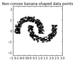
Change detection is a type of problem in which we want to detect an interesting change in a signal. In the tutorial, I consider the signal to be a stream of (scalar) values, and take an online approach to the problem. I leave it open to interpretation what we mean by “interesting change”.

A toy signal for change detection

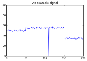
A toy signal for change detection. What kind of change is interesting? What is important to detect and what should be ignored?

The objective of the tutorial is to introduce to discuss some fundamental concepts in change detection, to highlight some important use-cases of these algorithms, and to encourage the reader to think about the context of the problem before designing a solution.

I find this topic very interesting, and I’ve been fortunate to have had the chance to work on a few projects over the last years in which change detection was an important component. The problem is also tied to the more general subject of anomaly detection, which is turning out to be a recurring theme in my work.

Most importantly, I think there is a huge and growing demand in this subject. It is simply impossible to use purely manual methods to keep tabs on the tremendous amounts of data that we’re generating as a society, and in many scenarios the most interesting things are those that are NOT normal — they that fall rapidly, they rise sharply, they fit an unusual pattern or or they do not fit a usual pattern. Systems that utilize change detection algorithms — often as part of a larger solution — will help us sort through all our data and enable appropriate decisions to be made accurately and on time.

Topics Covered

Some of the topics covered in the tutorial are:

  • Online vs Offline algorithms, simulating online detection.
  • Designing residuals and stop conditions
  • Welford’s method
  • Comparing multiple windows on a single stream.
  • Anomaly detection in EKG signals

Some screenshots


online_detection_01

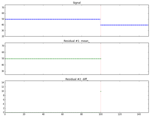
Simulating online detection algorithms. Here the stopping condition (fired at the vertical red line) is triggered immediately after the change.

seasonal_signal_01

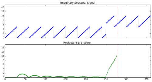
Detecting change in a seasonal signal (shown on top). The residual (on bottom) rises sharply after change, but is resistant to the seasonal variation.

noise_outliers_01

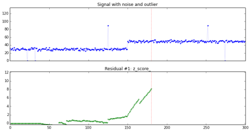
We study a signal with outliers and noise, and try to design a detector sensitive to change using z-scores.I’ve been working on a number of problems in the past few years on change detection and anomaly detection.

EKG signals

To look at EKG signals, I borrowed from Ted Dunning’s presentation at Strata. I recreated his solution in python (his solution, available on github at https://github.com/tdunning/anomaly-detection/ uses Java and Mahout).

I actually haven’t finished writing this section yet, it’s an exciting enough topic that I feel I could sink a lot of time into it. I spent (only) several hours reading and ingesting the EKG data, and (only) several more hours re-writing Ted Dunning’s algorithm. But after that initial effort, I put in a large amount of intermittent effort trying to make this section presentable and useful for a tutorial — and therein lies the time sink. I’ll fix this section up based on feedback from readers.


EKG signal

EKG signal

EKG_basis_dictionary_01

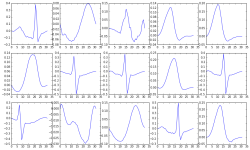
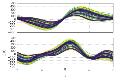
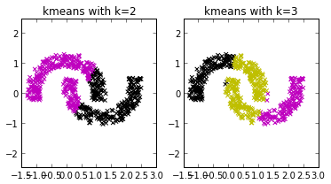
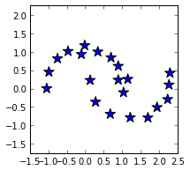
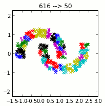
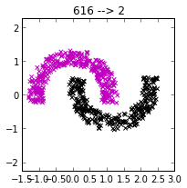
Using clustering, we construct a dictionary of small signal windows from which to reconstruct a full signal. Here are a few of the windows in the dictionary.

Ted Dunning’s approach to anomaly detection in EKG signals is as follows. First, a dictionary of representative small segments (windows) is created. These windows are found by using k-means clustering on a “normal” EKG signal. This dictionary, constructed from the training data, is used to reconstruct the EKG signal of interest.

If a test signal is successfully reconstructed from the dictionary, the signal is much like those found in the training data, and can be considered normal. If the reconstruction has a high error rate, there’s something in the signal that may be anomalous, suggesting a potentially unhealthy EKG that should be investigated further.

reconstructed_EKG_01

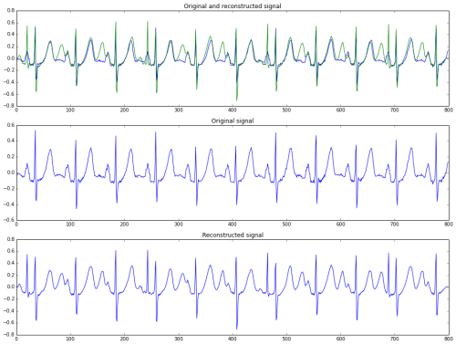
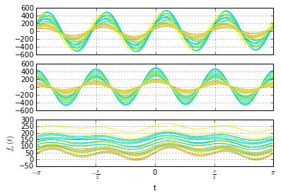
A reconstruction (bottom row) of an EKG signal (middle row). The top row shows both signals superimposed.

I have not tuned the model in the tutorial; there is room for improvement in the training phase, parameter selection, and other adjustments. That’s another potential time sink, so I’ve temporarily convinced myself that it’s actually better, for a tutorial, to leave that as an exercise for the reader.

If all this sounds interesting, please do take a look at the tutorial here:
https://github.com/amanahuja/change-detection-tutorial

I’ll be happy to receive any comments or feedback!

UC Berkeley BIDS Launch and Conscilience

Yesterday I attended the launch of the University of California Berkeley Institute for Data Science (BIDS). The Moore and Sloan Foundations announced a 5 year, $37.8 million contribution to kick start this Institute, which will be the third of its kind in the country. The other two are at the University of Washington and NYU. The Institute will open physically in 2014, with a pretty nice real estate inside the Doe Memorial Library.

Univerity of California, Berkeley logo

Univerity of California, Berkeley logo (Photo credit: Wikipedia)

I am pretty enthusiastic to have this Institute so close to home. There will be great opportunities to attend events and take advantage of whatever resources are made available to the community at large (I’m not a student at Cal). More than that, I would be interested in contributing my own time, or enabling a collaboration with The Data Guild, in whatever way possible, to advance the local data science community through UC Berkeley.

Packed house at the BIDS launch event

Packed house at the BIDS launch event

The launch event consisted of talks and presentations by many of the people involved, including Cal Chancellor Nicholas Dirks, the director of BIDS (and Nobel laureate) Saul Perlmutter, Tim O’Reilly, and Peter Norvig of Google fame. There were also interesting talks about academic data science projects currently in progress at the University. 

A key idea, one that seemed to form a common thread across all the talks, was that of conscilience. The term was popularized by EO Wilson in 1998 in his eponymous book, in which he talks about disciplines —  the hard sciences, the social sciences, and the humanities — moving closer to each other. Part observation and part projection, Wilson pointed out that part of this bridging between disciplines would be due to advances in technology and computation.

In the data science context, this shrinking of gaps between previously distinct communities and cultures is often observed between the scientific/academic and the commercial/industrial communities, two groups which historically have had very different objectives and approaches. We have seen in recent years that this is changing rapidly. Joshua Bloom noted in the panel discussion at the end of the evening that they are still quite separate, and likely will always be separate, but that they are undeniably much closer together than they have been in the past.

The talks at the BIDS launch event went beyond this common observation, though. Several mentioned the meeting of the hard sciences with social sciences, and the inter-disciplinary collaborations through data science. They talked about in the benefit of learning to think about problems in new, more data-centric ways, and how such data-driven approach was methodologically-centered rather than domain-specific. They specifically described how this shift towards methodology would create new types of specialists that could operate successfully across many disciplines. They even described a shift in cultures, harkening directly back to EO Wilson, and back to CP Snow’s “Two Cultures” argument

Wonderful, and appropriate, that the launch of a new institute of data science should bring together so many bright persons from a broad array of backgrounds, and create an opportunity for these philosophical reflections. These next few decades are going to be a very exciting time, when we get to observe and be part of the contribution that data science is making to the unity of knowledge. 

Google Search definitions upgrade is amazing

Have you used a Google search to look up the definition of a word recently?

For a long while now, Google has returned a definition from some online dictionary or wiki. Now, not only has the definition section improved, but you also get the word usage over time (from Google Book n-grams) and a very cool etymology tree.

I’d love to find out more about how that etymology visual is being generated!

incorrigible - Google Search

Andrew’s Curves now free with python pandas (Reading log)

A blog post by Vytautas Jančauskas talks about the implementation of Andrew’s Curves in Python Pandas. These curves, introduced in David Andrew’s paper in 1972, allow one to visualize high dimensional data through transformation.

It is now trivial to generate such a plot from your pandas dataframe:

import pandas as pd
df = pd.Dataframe(some_data, columns = ['y', 'x1', 'x2', 'x3', 'x4', 'x5'])
pd.tools.plotting.andrews_curves(df, class_column='y')

I think this is a powerful and exciting tool that could be very insightful for exploratory data analysis.

SO_andrewscurves_03

Example: Andrews Plot of randomly generated data

I noticed a bug in the pandas implementation, which resulted in a Stack Overflow question and a pull request to pandas. The bug was corrected with impressive speed.

I read this paper that expounds upon some of Andrew’s ideas:
César García-Osorio, Colin Fyfe, “Visualization of High-Dimensional Data via Orthogonal Curves” (2005).

After playing around and reading a bit, I came up with some ideas for future work on this new feature:

Labels and ticks

In the above example plot, which I generated, the xticks are at multiples of π — which is sensible because what we are looking at is the projection of data onto the vector of Fourier series on the range (−π < t < π) . But the current pandas implementation has xticks at integer multiples. It also doesn’t provide axis labels. I should create a PR for this.

Column order

The shape of Andrew’s curves are highly influenced by the order of variables in the transformation. So in the pandas implementation, the order of the columns is significant.

Here are two plots of the air quality data set — the only difference is column order:
[Added the code I used to generate these plot at the bottom of this section.]

SO_andrewscurves_04_column_order

Andrew’s Curves on the same dataset (airquality), but with changed column order.

One might argue this difference does not matter… that if all you are doing is checking for structure in a dataset, then the shape of that structure is not important (compare the airquality Andrew’s Plot to the one with random data above). But in fact shapes can be very important when you are using visual data to develop an intuition about numbers. Also, Andrew’s Curves can be very informative beyond a binary “yes there is” / “no there isn’t” decision with respect to structure, and in that case the column order here could become analogous to bin widths in a histogram.

Here is the same “column-order experiment” as above, this time for the mtcars dataset:

SO_andrewscurves_06_column_order

Andrew’s Curves on the same dataset (mtcars), but with changed column order.

Surprised? Me too. For the sake of reproducibility, here are the column orders for the three mtcars plots:

['qsec', 'vs', 'am', 'gear', 'carb', 'mpg', 'cyl', 'disp', 'hp', 'drat', 'wt']
['wt', 'qsec', 'vs', 'am', 'gear', 'carb', 'mpg', 'cyl', 'disp', 'hp', 'drat']
['drat', 'wt', 'qsec', 'vs', 'am', 'gear', 'carb', 'mpg', 'cyl', 'disp', 'hp']

This is an inherent weakness with Andrew’s Curves, and no fault of pandas. The people that provide powerful tools cannot be responsible for mistakes that users might make. However, going along with analogy made earlier, anybody creating a tool to generate histograms will provide the capability to adjust bin sizes. In the same way, this vulnerability might need to be acknowledged in some way: by, for example, allowing the user to specify a column order when creating an Andrews Plot, or by allowing the user to generate several plots each with a random column order.

Other Plots

Andrew’s Curves also have other weaknesses, such as biasing some frequencies over others. Variations exist to address these weaknesses, and there are other visualizations built on the principle of transforming high-dimensional data. These might be worth exploring in more detail, but I’m out of time for now. See the paper by García-Osorio for more details.

The code used to generate some of the plots in this post:


import pandas as pd
import statsmodels.api as sm
#Change next two lines for dataset, such as in
#http://vincentarelbundock.github.io/Rdatasets/
data = sm.datasets.get_rdataset('airquality').data
class_column = 'Month'
fig, (ax1, ax2) = plt.subplots(nrows=2, ncols=1, sharex=True)
#Plot w/ original column order
andrews_curves(data, class_column=class_column, ax=ax1)
#Rearrange columns
cols = data.columns.tolist()
cols = cols[-1:] + cols[:-1]
data = data[cols]
#Plot w/ changed column order
andrews_curves(data, class_column=class_column, ax=ax2)
ax1.legend().set_visible(False)
ax2.legend().set_visible(False)
plt.show()


/cc @orbitfold @tacaswell @jtratner


Update (2013 Oct 30):
In the above column order test, I was simply cycling the column order, not shuffling them. In the plot below, I’m rearranging the columns completely using random.shuffle(). Also included as a bonus is a side-by-side comparison with a Parallel Coordinates Plot (PCP).

AndrewsCurves_ss01_vsPCP_shuffle_columns

On the left are Andrew’s Curves, and the right column of figures are Parallel Coordinate Plots. Each row has a different column order. [Used the mtcars dataset with ‘gear’ as the class column. ]

Joining The Data Guild

I am happy to announce that recently I’ve joined forces with The Data Guild!

What is — who are — The Data Guild? Their website says:

The Data Guild brings together deeply experienced data scientists, social scientists, designers and engineers from diverse industry backgrounds to tackle important problems and challenges.

This new relationship doesn’t encroach on any of the benefits and freedoms that I enjoy by working independently, and that was an important consideration. And there are great practical reasons to work with a team. But what really attracted my interest in The Data Guild, and the reasons why I want to work with them, are less tangible than these.

Cross-pollination

When I visited universities in India a few years ago, I had noticed a strong resistance to the sharing of knowledge that leads to creative thinking and unique ideas. The system in which those schools lived seemed severely limited in this regard. But by working as an independent consultant, I am constantly fighting a similar battle.

It costs me a great deal of energy to continually expose myself to new ideas and projects, to find inter-disciplinary collaboration. And I am rarely able to bounce ideas around with someone who understands the nuances of what I am talking about; I also lack intra-disciplinary collaboration.

By being part of a community like The Data Guild, I am hopeful to find frequent opportunities for such cross-pollination of ideas.

But that’s not the best part.

Impact

It has been two years since I started working independently as a consultant, and I have been naturally in a mood of self-assessment. I had quit my job back then because I was not satisfied in just earning a good salary. I had wanted to work on problems that I found more interesting and challenging. I feel good about what my progress on this front. But I had also wanted to work on projects that had some positive impact in a way that mattered to me. In that, I have far to go.

So it was perfect timing when, last month, I met with the founders of The Data Guild — Chris Diehl, Dave Gutelius and Cameron Turner. They talked about their vision of assembling a team of experts that were passionate about doing something significant with their efforts.

There is plenty of money to be made forming a company or working for one in the “big data” world. In this nascent industry, the “low-hanging fruit” — the business models that are immediately profitable — are ones that I do not find to be satisfying. Developing a new non-relational database, or optimizing bidding strategies for advertising — these projects are often technically impressive and have good business justification. But I do not find them compelling.

I would like to spend my time working on problems that are interesting not just for their own sake, but for the impact that they have on our world. On their first blog post, The Data Guild writes:

TheDataGuild

“We shouldn’t have been surprised; the best and brightest people we know want a chance to make a difference in the world, and to work creatively on teams where they can reach their full potential.  We wanted to create a space where these incredible teams could tackle the most significant global challenges we face – but also make a living doing it.  We wanted to challenge the idea that there’s a necessary tradeoff between making a difference and making a living.”

People who think like this are people I can be proud to work with. That is the reason I’m excited about working The Data Guild.


Links:

Kibana, Disqus at SF Python Project Night

At the #SFPython Project night earlier this week, Disqus gave us access to a pipeline of their data. Their data is composed of conversations (posts, comments, and votes) taking place throughout the web. As one of the largest blog (the largest?) blog comment-hosting services, they have a large amount of data.

The Data

The data we had to work with was streaming JSON. Mostly we were there for beer, food, and socializing, but in between sips we managed to make some efforts in tinkering with it.

Hacks

Rob Scott of Inkling was only there for about 20 minutes, but he had enough time to throw together a sweet recursive python script that made it easy to parse out fields in the streaming JSON data. https://gist.github.com/rbscott/6694512

I wrote a script to examine documents in the stream and conditionally add an event to one of several time-series. I was planning to use the stream to populate time series for things like “Votes”, “Posts by Users with n+ followers” “Comments by female users”, “Likes by Users in South America” etc. Then I hoped to use some existing time series anomaly detection libraries. I abandoned this effort in favor of a different idea…

Bobby Manuel of Shoptouch walked by and suggested using ElasticSearch + Kibana, which works very well with JSON data. We all agreed this was a great idea. It is also exactly the kind of thing that’s great for a hackathon — a pretty impressive output for a very small amount of work.

Elasticsearch + Kibana, very quickly

There wasn’t much time left when Bobby shared his idea. I had to start from scratch, installing Elasticsearch and Kibana, so I took several shortcuts. Instead of working with the JSON stream, I piped a few seconds of the data to a file, indexed it via bulk import in Elastic Search, and setup a Kibana dashboard.

The following are a few screenshots of the results. The first shows a breakdown of events in the pipeline by Message Type (Vote, Post, Threadvote, etc).

Disqus events by message_type

Disqus events by message_type

The second is what Kibana calls a “histogram” — I would find a different name — showing counts of events in buckets of 100 milliseconds. The interesting thing here is that Kibana easily parsed the timestamp once I specified the field. I was also able to filter by time ranges.

Histogram of events by time

Histogram of events by time

There were some other interesting screenshots that I will not post here since I don’t actually own this data.  but I was starting to explore the actual content of the data and users. A simple query revealed that “LOL” is more common than “ha”. The Disqus API allowed me to look up user details by the user id in the stream, so there is potential for augmenting the data stream in various ways.

Next?

This didn’t take much time; the biggest time-suck was what I thought was an encoding/unicode related error during the bulk import. If I had had more time I would have liked to work with the actual JSON data stream rather than a small segment of it.

One step would be to ease resource constraints by using something better than my little laptop. An EC2 instance would be enough, I think for a hack it would be just fine to stick ES and Kibana on the same box.

The second step would be to find an easy way to continually index the stream in Elasticsearch. One approach would be to use the pipe input API in Logstash (http://logstash.net/docs/1.2.1/inputs/pipe). I was already using curl to pipe the data stream to stdin, so this would be a straightforward proof-of-concept. Easy trumps robust for hacks. Alternately, I could have writen a script that catches the incoming JSON documents, adds the necessary metadata, and XPUTs them into Elasticsearch.  I explored neither of these approaches, and had another burrito instead.

Conclusion

I’m almost embarrassed that the Elasticsearch family of tools wasn’t already in my tool-belt for exploratory data analysis. They are now. It takes much less time that I had expected to set up and get useful results.  They are flexible with various types of input. And the above hacks barely scratch the surface of what is possible to do with ES.

These tools aren’t just for finely tuned production environments to deliver specific functionality around search.  Give them a try for data exploration and quick results … and hackathons.


/cc @bobbymanuel @cpdomina @northisup @rbscott7 @disqus

Data.gov, Open Government Platform, and Cancer data sets

After attending a lecture at University of San Francisco by Jonathan Reichental (@Reichental) on the use of open data in the public sector, I started poking around some data sets available at Data.gov.

Data.gov is pretty impressive. The site was established in 2009 by Vivek Kundra, the first person with the title “Federal CIO” of the United States, appointed by Barack Obama.  It is rapidly adding data sets; sixty-four thousand data sets have been added just in the last year.

Interestingly, there is an open-source version of data.gov itself, called the open government platform. It is built on Drupal and available on github. The initiative is spear-headed by the US and the Indian governments, to help promote transparency and citizen engagement by making data widely and easily available. Awesome.

The Indian version is: data.gov.in. There is also a Canadian version, a Ghanaian version, and many other countries are following suit.

I started mucking around and produced a plot of the Age-adjusted Urinary Bladder cancer occurrence, by state.

  • The data was easy to find. I downloaded it without declaring who I am or why I’m downloading the data, and I didn’t have to wait for any approval.
  • The data was well-formatted and trivially easy to digest using python pandas.
  • Ipython notebook and data source available below.


dataGOV_UrinaryBladderCancer_ByState


If you’re interested in this data, you should also check out http://statecancerprofiles.cancer.gov/ , which I didn’t know existed until I started writing this post. I was able to retrieve this map from there:

statecancerprofiles_Bladder_USmap


Non-convex sets with k-means and hierarchical clustering

Bad mouthing old friends

I got into a conversation recently about k-means clustering —  you know, as you do — and let me tell you, poor k-means was really getting bashed. “K-means sucks at this”, “K-means can’t do that”. It was really rather vicious, and I felt I had to step up to defend our old friend k-means. So I started writing up something that shows that those oft-highlighted weaknesses of k-means aren’t nearly bad as people think, and in most cases don’t outweigh the awesomeness that k-means brings to the party.

It started to get quite lengthy, so I’m breaking it up into pieces and maybe I’ll put it all together into one thing later. This post is the first of those pieces.

Convex sets

“K-means can’t handle non-convex sets”.

Non-Convex set

A non-convex set

Convex sets: In Euclidean space, an object is convex if for every pair of points within the object, every point on the straight line segment that joins them is also within the object. [Source: Wikipedia.]

The k-means algorithm, in its basic form, is like making little circular paper cutouts and using them to cover the data points. We can change the quantity and size and position of our paper cut-outs, but they are still round and, thus, these non-convex shapes evade us.

That is, what are doing when we use k-means is constructing a mixture of k-gaussians. This works well if the data can be described by spatially separated hyper-spheres.

Here’s a clustering example, borrowed directly from the sklearn documentation on clustering. These are two slightly entangled banana spheres. That’s two non-convex shapes, and they are not spatially separated.

banana_shape

When we try to use k-means on this example, it doesn’t do very well. There’s just no way to form these two clusters with two little circular paper cut-outs. Or three.

k-means on the banana shapes

k-means performs poorly on the banana shapes

K-means pairs well

But by combining k-means with another algorithm, hierarchical clustering, we can solve this problem. Pairing k-means with other techniques turns out to be a very effective way to draw from its benefits while overcoming its deficiencies. It’s like our theme. I’ll do it again in another post, just you watch.

First, we cluster the data into a large number of clusters using k-means. Below, I’ve plotted the centroids of clusters after k-means clustering using 21. [Why 21? Well, actually, it doesn’t matter very much in the end.]

Centroids of 21 kmeans clusters

Centroids of 21 k-means clusters

Then, we take these many clusters from k-means and then start clustering them together into bigger clusters using a single-link agglomerative method.  That is, we repeatedly pick the two clusters that are closest together and merge them. It is important in this scenario that we use the “single-link” method, in which the distance between two clusters is defined by the distance between the two closest data points we can find, one from each cluster.

Here’s what that looks like:

hierarchical clustering animation

Woah woah. Did you see that one near the end? The one where we’ve taken 616 data points, formed a whole bunch [I used k=51 for the animation to get lots of colorful frames] of clusters with k-means , and then agglomerated them into … this:

clustered bananas

Yup, that one. So pretty.

So many benefits

You get it already, I’m sure. We’re making lots of those little circles, covering all the data points with them. Then, we are attaching the little circles to each other, in pairs, by repeatedly picking the two that are closest.

K-means and single-link clustering. Combining the two algorithms is a pretty robust technique. It is less sensitive to initialization than pure k-means. It is also less sensitive to choice of parameters. When we have many points, we use an algorithm that is fast and parallelizable. After the heavy lifting is done, we can afford to use the more expensive hierarchical method, and reap its benefits, too.

There are many additional problems with k-means: sensitivity to initialization, the need to pick k, poor performance in high-dimensions. Today we looked at those damn non-convex sets. I’ll dive into some of the others in future posts.

By the way, in the banana shapes solution today, note that we don’t have to specify ahead of time the expected final number of clusters. We specified some arbitrary large number for k, but we finished up with hierarchical clustering. We could use one of many well-studied techniques to decide when to stop clustering. For example, we could automate a stopping rule using concepts of separation and cohesion — see this post for a hint.

Related posts:

Reading workflow and backposting to reading-log

One of my categories on this blog is “reading-log“, which I intended as a way to highlight one of the books, articles or papers that I’ve read recently. I’ve been very negligent at this, but fortunately this is one of those situations where it’s not too late to do so.

I keep notes (on Evernote) with the date that I read the material and thoughts that it inspired. So I can still go back and post them retroactively. I can even artificially date the WordPress Post. I’ll be trying to do some of that over the next few days. If all goes well, subscribers will see a flurry of activity (which hopefully doesn’t chase any of them away).

I’ve been reading a lot these days. My reading workflow is always evolving, but I’ve got a system that seems to be working pretty well, and as a result I find it easier to read more and be efficient.

Image

I use Feedly, to which I switched after the days of Google Reader. I currently have 120+ sources (web feeds) in six or seven categories. I am picky with my subscriptions, and feeds that feel like clutter are weeded out (I have a separate category for feeds “on probation”, and I’ll skip those articles on busy days). After years of this, I find that a lot of value and entertainment in my feeds.

I skim these web feeds on my phone using Feedly’s android app. This is fast consumption, and easy to do when taking a break or during in-between moments. Anything requiring deeper attention or more time, I save for later, using Pocket.

In addition to web feeds via Feedly, my Pocket queue is populated by tweets, web browsing, active research, and things-people-send-to-me. The ability to easily save anything for later means I have fewer interruptions and distractions. There is a separate time and place for consuming all that material. This makes me more efficient.

When researching on a particular subject, for personal interest or for a client, I read papers and “heavier” articles. I have a Dropbox folder where I keep this research material, and it stays there even after I’ve read it, for future reference. I’ll often transfer unread articles from this folder to my Kindle; I always keep the ol’ ebook filled with a collection of unread novels, non-fiction books, and dozens of research papers. This is particularly wonderful when traveling, as I am now.

We all have so many sources for reading material, and there are a lot of tools to help us manage everything. I’ve shared only the most significant of the tools that I use, (and hinted at the taxonomies I’ve invented to organize things) with which I’m able to read, and watch, and listen to, a lot more material without feeling overwhelmed or constantly interrupted.

Keep an eye on this reading-log WordPress category — I’ll be doing that back-posting and perhaps you’ll find we have common reading interests.


Mean absolute percentage error (MAPE) in Scikit-learn

On CrossValidated, the StackExchange for statistics, someone asks:

How can we calculate the Mean absolute percentage error (MAPE) of our predictions using Python and scikit-learn?

Mean Absolute Percentage Error (MAPE) is an metric used to determine the success of a regression analysis. Read my answer on CV here:

http://stats.stackexchange.com/questions/58391/mean-absolute-percentage-error-mape-in-scikit-learn/62511#62511

Continue reading